Comics /
Spotlight
Daredevil Shadowland Covers are Lacklustre
By Hervé St-Louis
November 2, 2010 - 08:35
I’ve been piling up on my Daredevil comic books for several months now. It’s hard to get into them. I didn’t like the Shadowland premise to begin with, so that never helps. But there’s something else that always ensure that a comic book stays at the bottom of my reading list. It’s comic book covers. John Cassaday, the otherwise magnificent artist that gave us Astonishing X-Men a few years ago has been signed up to deliver all of the Daredevil covers for the Shadowland mini-series and crossover. They are boring. I was surprised when I first saw his name attached to the covers. The covers feel like comic book covers from the 1960s. They are boring and bland. The characters are for the most part just standing up looking at the reader. Nothing happens. Now starring at the reader is not bad, but at least some kind of dynamic posing should be required.
 |
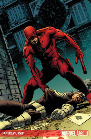
Sure Cassaday is great artist. There is no doubt that his figures are well proportioned and realistic. The problem is that they are too conformist and restrained. Of the many covers he has drawn for both Shadowland and Daredevil, only the Daredevil 508 where the hero is pulling a defeated Bullseye has any interest. Still, it’s all too perfect and clean. If it weren’t for the cool backdrop, it would be a boring cover.
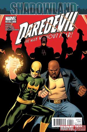
Daredevil #509 is downright incompetent. Iron Fist and Cage are just standing there looking mean but not really involving the viewer. There’s an overbearing Daredevil with his gang in the back but not much else. I think that cover fails mostly due to Cassaday having cut the feet of the characters in the foreground at their ankles. It’s never a great composition choice to make as they seem to be floating and there’s no way to relate them to the backdrop with the silhouette ninjas.
 |
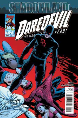
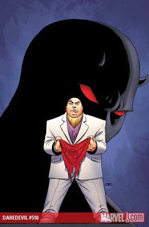
Daredevil #510 has the Kingpin standing up with a piece of Daredevil’s garb looking like a gnome instead of the imposing figure he really is, partly thanks to the shadowy figure of Daredevil in the back. Daredevil #511 is as bland with the hero having defeated all his buddies and standing over them. There’s no foreground with arms, cowls and capes springing out from the edges of the comic book page. It’s not exactly a bird’s eye view shot either. Everything is at the eye level without any dimension. It looks plain and boring. There’s nothing happening in this cover. You can’t feel threatened by Daredevil nor feel any pity for him.
 |
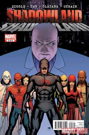
Shadowlands covers don’t fare better. I understand the draw of using a “big name” artist for comic book covers, but when they don’t deliver on the hype and the talent readers expect of them, the effect are books not being read and piling up for weeks. If I were not a regular subscriber to Daredevil, I would not pick up these books at the comic book store. On the shelves, they look just too boring to bother with.
Last Updated: March 3, 2025 - 20:40