
Modern Times (Squared)
By Philip Schweier
March 6, 2024 - 13:14
Image Comics
After
an absence of almost 40 years, Howard Chaykin resurrected his Time2 with the recent release
of The Time2 Omnibus. In the decades since the original
material was published in the mid-1980s, printing technology has evolved from
hands-on paste-up methods to digital, computer-based formats.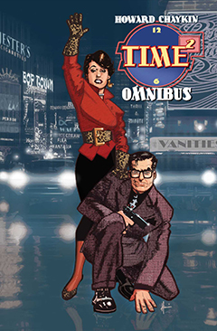
Chaykin’s long-time collaborator Ken Bruzenak met the challenge of merging the two original stories with a new third installment. “(He) delivered an extraordinary job of reclamation and graphic/digital adjustment,” says Chakyin.
To clarify, the book is not a George Lucas-style reinvention of original material, but an upgrade of the original chapters. Bruzenak cleaned them up to provide the best possible version of the entire series.
“It
was an experiment to see if it could be done,” admits Bruzenak. With all the
original pages scattered throughout the collectors’ market, it began with
dissecting printed copies of the
original chapters (The Epiphany and The Satisfaction of Black Mariah) and
scanning the pages into Photoshop at 400 DPI (dots per inch). The black plate
was then extracted at two different settings. This enabled him to identify
elements clearly visible on one plate but less so the other, cleaning them up and then
merging the two plates together.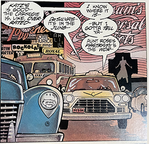
An original panel, as published in 1986
The next step was to then eliminate half-tones from the scanned images, to obtain pure, clear colors. “It was a long, laborious process,” says Bruzenak. Lettering had to be addressed, as some pages originally scanned better than others, contributing to a murkiness to be fixed.
The
work of original colorist Steve Oliff served as a guide, but Bruzenak made
changes in the interest of consistency and continuity. He also added subtle
touches to enhance the visuals, such as flares from car headlights. 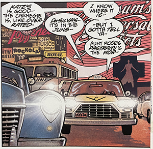
The same panel, after Bruzenak's digital upgrade
“It’s a more cohesive package, but even the proportion of the pages, you can tell the first book was drawn for the oversized Time2 format, but the second book was drawn for a regular comic book. When that is blown up, sometimes things just bled off the side (of the page), right though somebody’s head.”
Applying 21st century technology to material originally produced in the 1980s illustrates the advances in printing technology. While he admits computers can streamline the process of creating a comic book, he fondly recalls a more hands-on approach.
“The 1980s were a very different time,” says Bruzenak, who lettered various titles for First Comics lettering in the early ‘80s. “I was working on the original art boards. That is so energizing, to see the original pencils, to see how they draw. You don’t see that any more.”
When Chaykin launched American Flagg! at First, Bruzenak incorporated typography into the graphics in manner that complemented the artwork very well. Forty years later, Bruzenak and Chaykin continue to collaborate. “When I letter these days, I want to have fully colored, finished stuff so I can integrate with the artwork.”
Their next project will be Fargo: Hell on Wheels, an adaptation of one of a series of adventure novels written by John Benteen in the 1970s.
Related Articles: