
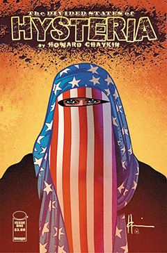
Review: Divided States of Hysteria #1
By Philip Schweier
June 15, 2017 - 11:57
Image Comics
Writer(s): Howard Chaykin
Artist(s): Howard Chaykin
Colourist(s): Jesus Aburtov
Letterer(s): Ken Bruzenak
 |
There is currently controversy surrounding a sequence in the book, a three-page passage that has outraged a certain segment of society. I will address that elsewhere, and only say that I would suggest potential readers not allow a brief depiction to discourage them from following the book. My interpretation is that it would be akin to dismissing Catch-22 for how it portrays the horrors of war.
In Divided States, Chaykin has managed to tap into the general mood of America, fueling his narrative with the division and resentment that currently flows about our collective ankles like sewage from a broken toilet. Being only the first issue, I am unable to legitimately critique the overall story. But kudos to Chaykin for being so prescient.
Visually, the book reminds me of Chaykin’s American Flagg! from the 1980s, which also featured the lettering of Ken Bruzenak. He has continued to collaborate with Chaykin since then, and his typographic contributions are sometimes illustrations unto themselves.
However, 30+ years of digital technology has allowed for wider latitudes in terms of production. Here Bruzenak has cluttered the pages with sound effects, signage, background noise, and social media chatter. While it may ad some veritas, I found it distracting; for me, it threw the visual narrative off-balance. I rely on a comic book letterer to distill the prose content into a reader-friendly narrative flow. Some additional window dressing may be called for, but in general, my creative philosophy is “less is more.”
The same could be said of Aburtov’s coloring. Modern technology allows for more ambitious coloring, which sometimes borders on digital painting. However, Chaykin’s rendering often includes texture, and an excess of color “styling” can lead to a visual struggle.
Howard Chaykin continues to challenge the comic book community, in terms of content and production. And he continues to challenge readers on how they interpret words and pictures. Love him or hate him, it’s rarely dull.
Related Articles:
Image Comics Presents Fraction and Chaykin's "Satellite Sam"
Star Wars Insider announces exclusive Howard Chaykin cover & poster!
Klaus Janson/Howard Chaykin Artist's Workshop at the 2010 Baltimore Comic-Con
Howard Chaykin on Marvel Comics Podcast
Howard Chaykin Announced as Blade Artist
Will Eisner eNewsletter #30: Interview Series Starts With Howard Chaykin!
Howard Chaykin: Back to the Drawing Board
A Whole lot of Chaykin Goin' On