|
|

|
|
The previous logo had been the longest running one at ComicBookBin. Introduced in 2008, it was meant to represent a man reading comics where many of us read them, in the restroom.
When I introduced this concept, we lost a writer who felt that this logo was in poor taste. I still don’t think that it was. It really is where most guys read comics and books! It was also a feeling of rebellion saying to the rest of the comic book industry that we were independents and would do things our way. I’m a bit older now and I don’t need to prove anything to the rest of the comic book industry. We have been around since 2002, always owned by the same person (me). Comics change so fast but we remain, steady, steadfast. Comic news and review sites are not that popular anymore because of social media. Most people get their comic news and reviews from YouTube and podcasts.It's a bit odd for a visual medium.
I had been meaning to change the logo for a while. ComicBookBin does not have to justify its difference, its independence, nor its resistance anymore. At the same time, logos tend to become simpler. A decade ago, I would never have used something as obvious as a comic bubble in a comic-related logo. It’s just so easy and cliché, I used to think. So instead, I went with a guy doing number two on a box of comics. How many of you had figured that out?
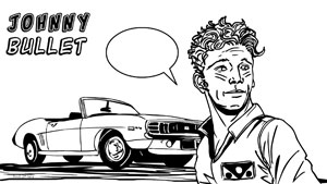
Messaging matters. I don’t have qualms about using obvious comic imagery if it clearly states who we are. ComicBookBin is a comic news and review site. I still kept the tricolour sports team logo which I fell in love with a long time ago. Primary colours matter in comics. I haven’t changed the typography of the word “ComicBookBin” yet. That can come next year as we turn twenty.
There are so many pages with the logo that need to be changed that it will take a while for me to spot them all. I have to mention how I love the Internet Archives from the Wayback Machine. I use the site often to find old versions of the Bin. The Bin’s first logo was serviceable. Not inspired. The second logo from 2003-2005 was too busy and complex. The third from 2005-2008 was unreadable as the word ComicBookBin, even though it looked nice.
Thank you for visiting the Bin!
Hervé
© Copyright 2002-2026 by Toon Doctor Inc. - All rights Reserved. All other texts, images, characters and trademarks are copyright their respective owners. Use of material in this document (including reproduction, modification, distribution, electronic transmission or republication) without prior written permission is strictly prohibited.