|
|

 |
Attached are three JPG sketches I'd like to submit for your web site design competition. The three pages all represent the same design, but showcase three different pages on the Comic Book Bin site: namely, the home page, the main Comics page, and an article. Let me start with some notes...
I started with a wider content area. Current statistics show that 86% of web users have 1024x768 or larger monitors. (http://www.w3schools.com/browsers/browsers_display.asp) There's a little extra room on either side to accomodate different browsers' chrome.
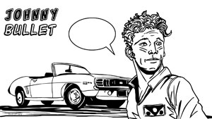
I've based the overall design directly off the logo. It has an interesting mix of old elements (the font) and new (the graphic and color scheme). I've tried replicate that somewhat in the design, using "modern" graphics and typography, but with a pale yellow, lightly textured background. I find this design does not work nearly as well, if placed on a simple white background and I would like to emphasize it is an integral part of the design.
Usability is a key consideration of mine, so I also changed some of the main navigation links around a bit. I've added a separate link for "Contact" which would accomodate the four areas you currently have specified. I've also moved "Mobile Edition" from the main navigation, since it's not really a navigation item and more a presentation format, like RSS or the Newsletter. Those three are collected together accordingly.
I've eliminated the use of right-hand graphic navigation. I think these bear too much similarity to ads, don't adequately convey the sections they direct to, and are superfluous againt the top navigation in the first place. This, I feel, probably contributes more to user confusion than providing a useful navigation alternative.
I've indicated the look of the main navigation drop-downs on the main page. Functionally, it would work as they do now, just with a slightly different visual. The "down" and "side" arrows in the current version of the site are unecessary, as the user has to hover over those items to link to them whether they want to jump directly to a sub-section or not. Naturally, this treatment would be applied across all pages.
On all of the pages, I've placed ads, trying to replicate the general number and placement you currently have. In every case, though, the ads should be able to be removed in their entirety, and you would be simply able to "roll up" the empty space with actual content, should you not wish or are unable to run ads in those designated areas.
The home page and the main Comics page would work similarly, the main difference being that the home page has an allotted space of a lead article, while that space is used for a more general section description on the Comics page. I recommend unifying the promo artwork for article slugs on these pages; the ones I'm presenting here are all 75x101. I think they tend to work better if they are cropped in on a portion of a relevant image (as shown on the main page) but they can also work with nearly complete cover art (as shown on the Comics page). Although, I think you should absolutely continue to link to articles and sections through those slug titles, it gets visually disruptive to have all of that text underlined, so I've added a simple "Read More" link at the end of each which will be underlined, to provide a visual clue of the link without having to undeline everything. I've only depicted six articles on each page for the sake of brevity, I think two columns of ten -- like you have currently on the home page -- would work well.
Both pages also display "Previous" and "Next" links towards the bottom of the layout. Obviously, the "Previous" link would be removed for the initial pages, and the "Next" removed for the last of them.
The article page has space along the right for a main graphic, but other art could obviously be scattered throughout the article as warranted. (I'm presenting here only a portion of one article, again, for the sake of brevity.) Links to both related articles and generally recent articles appear on the right. I suggest truncating the titles so that link remains only on one line. The article title does appear twice, deliberately, since there tends to be a lot of "header" type information to accompany each article. For reviews, I would run the meta-data (credits, price, etc.) immediately after the second time the title appears. Comments, naturally, remain at the end of the article.
One final note, on the date/time stamps. I would
format these in something that's a little more common/user friendly than they're
currently set. I would abbreviate the month (with a period) followed by the date
and year. Then present only the hours and minutes in a standard 12-hour AM/PM
format. If you do wish to go with the 24-hour notation, I'd still recommend
removing the seconds and the AM/PM stamp; the seconds provide more information
than a user cares about, and the AM/PM designation is superfluous in a 24-hour
notation.
Overall, I think there's a much better utilization of the space with this design which, while refreshing the general look and feel of the site, is not so overwhelming new as to confuse regular visitors. As I said at the start, my key aim as a website designer is usability.
© Copyright 2002-2026 by Toon Doctor Inc. - All rights Reserved. All other texts, images, characters and trademarks are copyright their respective owners. Use of material in this document (including reproduction, modification, distribution, electronic transmission or republication) without prior written permission is strictly prohibited.