
Comics News
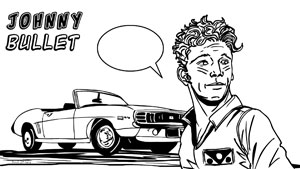
Johnny Bullet - What’s in a Comic Book Logo?
By Hervé St-Louis
September 3, 2014 - 13:16
The comic book logo is a tenured art form that is part of the enjoyment of comics. The logo is part of the branding and the signature of a comic. Even logos for Web comics have to be special. I would like to write more about comics logo today but what I wanted to do was introduce the new Johnny Bullet logo I’ve designed. Johnny Bullet, if you recall, is a new Web comic I’m working on and that will launch soon.
When I started Johnny Bullet, I created a hand drawn logo that did the job as a placeholder but as you can see was not as good as the one I’m using now. It was dynamic but the direction of the letters did not point to one direction. It had an early 1970s feel though which is something that I like. It reminded me of Yellow Submarine. I don’t know why.
The new logo is cleaner and more contained. It’s easier to read and will look much better over the backgrounds I like to put it on. With the inverted black and white, it reinforces the black and white style of Johnny Bullet as a comic strip. It contrasts quite well. It has energy but unlike the older logo, it’s not overflowing. An important thing for me is that it adds more seriousness and professionalism to Johnny Bullet as a Web comic strip. It shows that I’m serious about this project.
To create the Johnny Bullet logo, I used fonts under the free license for small self-publishers offered by Blambot.
© Copyright 2002-2026 by Toon Doctor Inc. - All rights Reserved. All other texts, images, characters and trademarks are copyright their respective owners. Use of material in this document (including reproduction, modification, distribution, electronic transmission or republication) without prior written permission is strictly prohibited.
|
|
